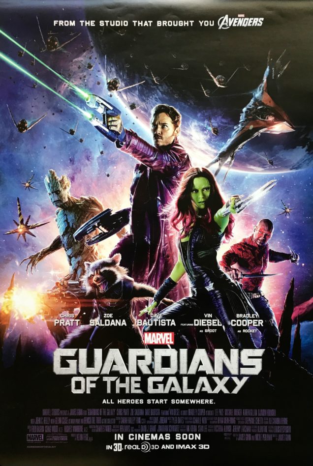
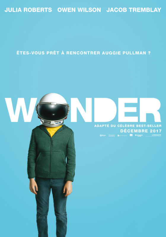
poster project/finished poster.
Planning for my poster.
For my poster I am going to have the background one colour and with the title and then a picture behind it. Having just a colour background and not of loads of little things in the background to distract you from the title and main graphics of the film. my main target audience for my poster is going to be for my other class mates and other students and teachers of the college.
Title- the title is going to be just above the middle of the page.
Picture- 'sitting' on the words.
Background- baby blue.
Subtitle/slogan-'who knew a flower could be so dark' what will be at the bottom of the poster.
Font-Niagara engraved.
 I want to base my poster on the Jurassic park poster with a block colour background with just a simple picture, title and slogan. I like this poster because your attention goes straight to the title instead of random pictures around the title. Also the title is in the middle of the poster so it it still the first thing you see instead of it being at the top or bottom. The red on a completely black background also catches your attention if you are walking past it because the colour and red is the colour that catches your attention the most.
Or this like this poster what was made by a fan, my poster will have a more minimalist look to it with just the title and a picture to represent part of the film. I feel this draws people as they want to know what the picture represents in the film. also this poster differs from lost of other colours with the colour and the fact that it is so 'bland'. so people stop to look at it.


Comments
Post a Comment